References
About
Erica Elizondo
Work
NASAD Exhibition
At the College of Architecture and Design at Lawrence Technological University, the NASAD Accreditation Team was scheduled to come visit in the Fall of 2025 and evaluate the college to determine if it can remain an accredited program. I was chosen by the Interim Dean and some professors, along with four other students, to help create and execute the exhibition brand for the important visit. With this team of graphic design students, we ideated and developed a brand identity for the exhibit.
Our identity focused on highlighting the aspect of “process” when it comes to the flow of design. So, we used a lot of references to process materials used when ideating and creating like sticky notes, paper, cork board, etc. We each determined who would be tasked with executing the necessary deliverables. I helped communicate with faculty from the school to get information and work we would need to showcase. I also created and prototyped the entire digital interface that the NASAD team would need to look at to view all the projects in an organized manner.
Project Type
Branding, Print & UI/UX
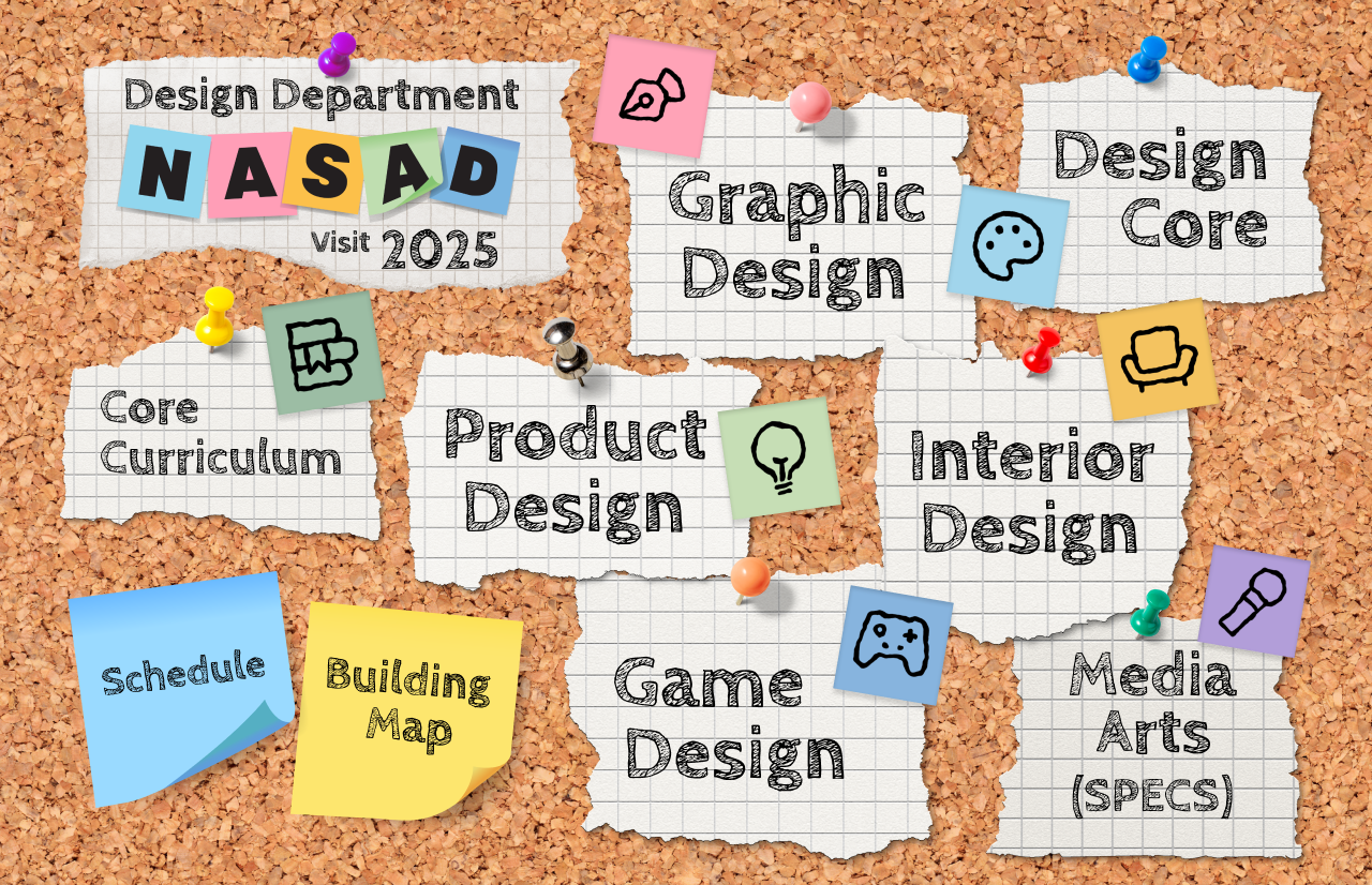
Programs



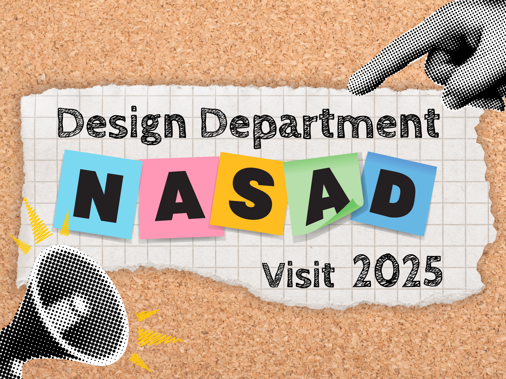
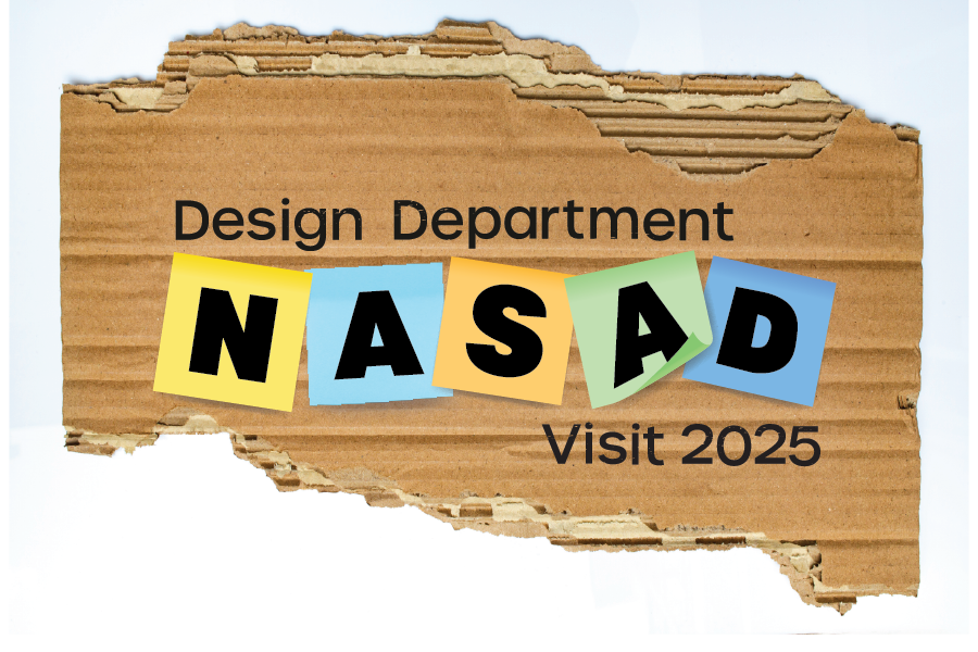
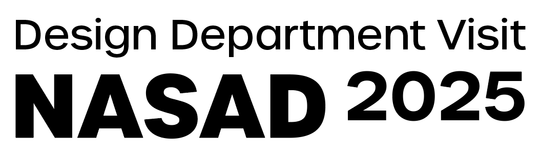
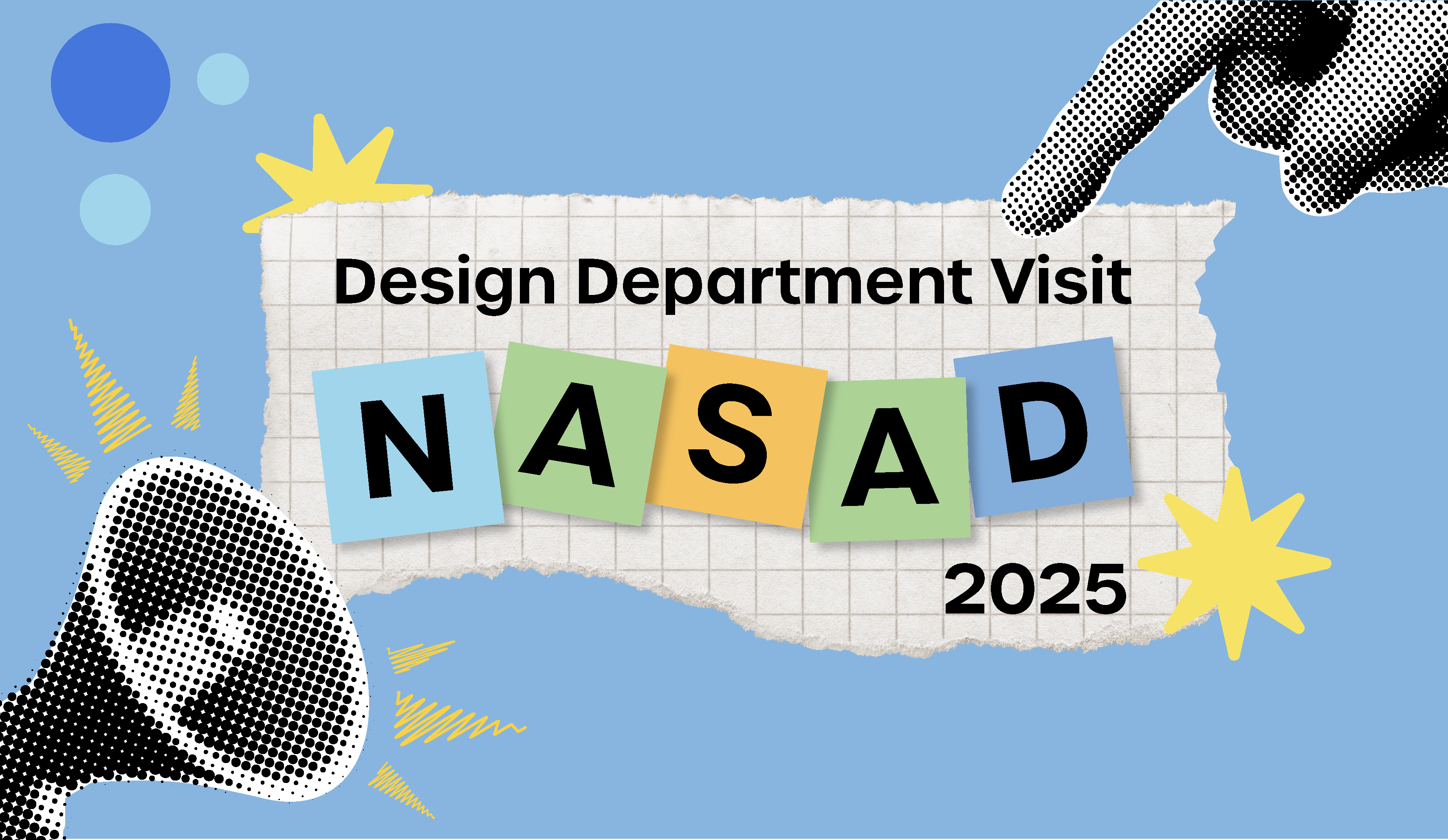
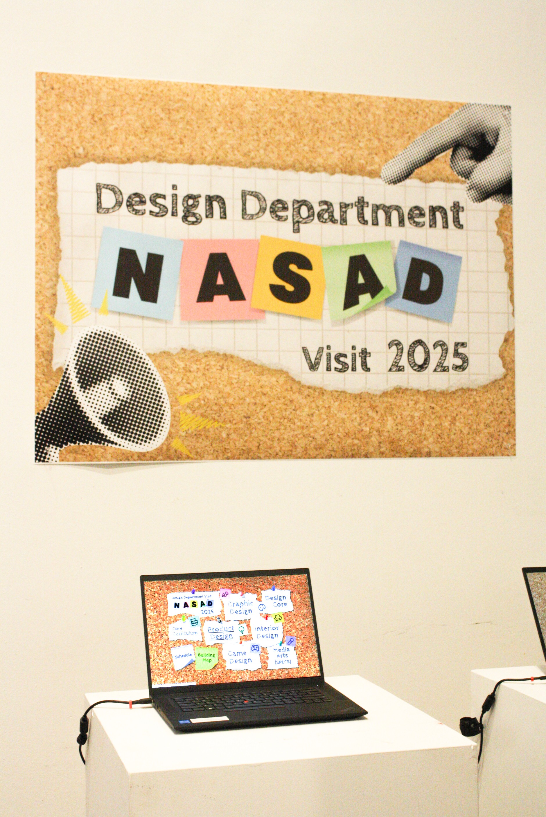
“Design Department NASAD Visit 2025” Main Logo/Entry Poster
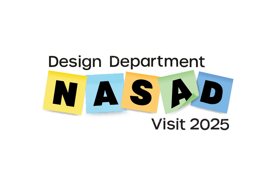
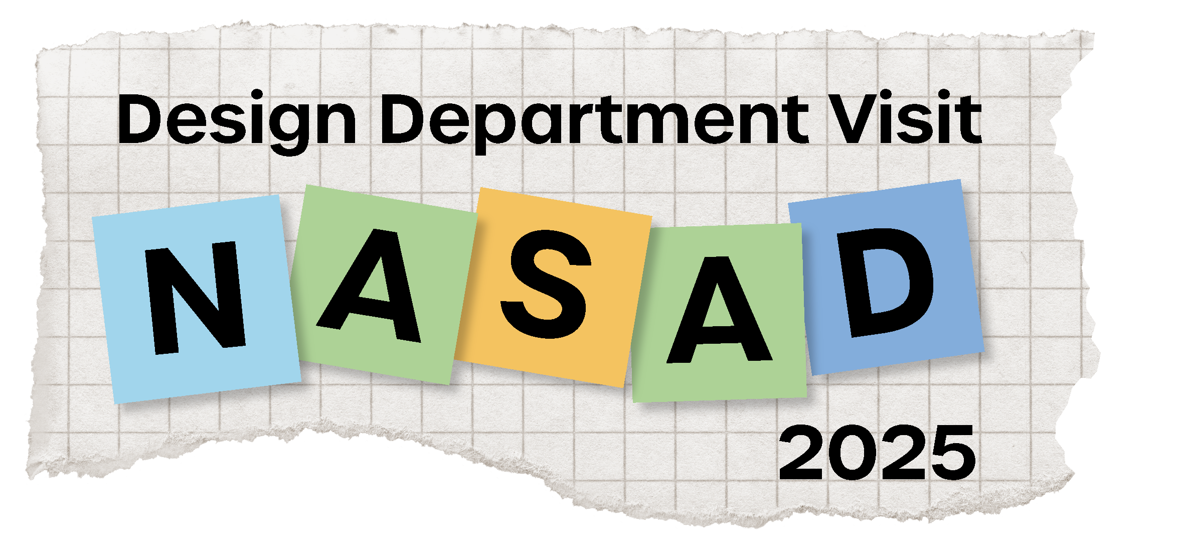
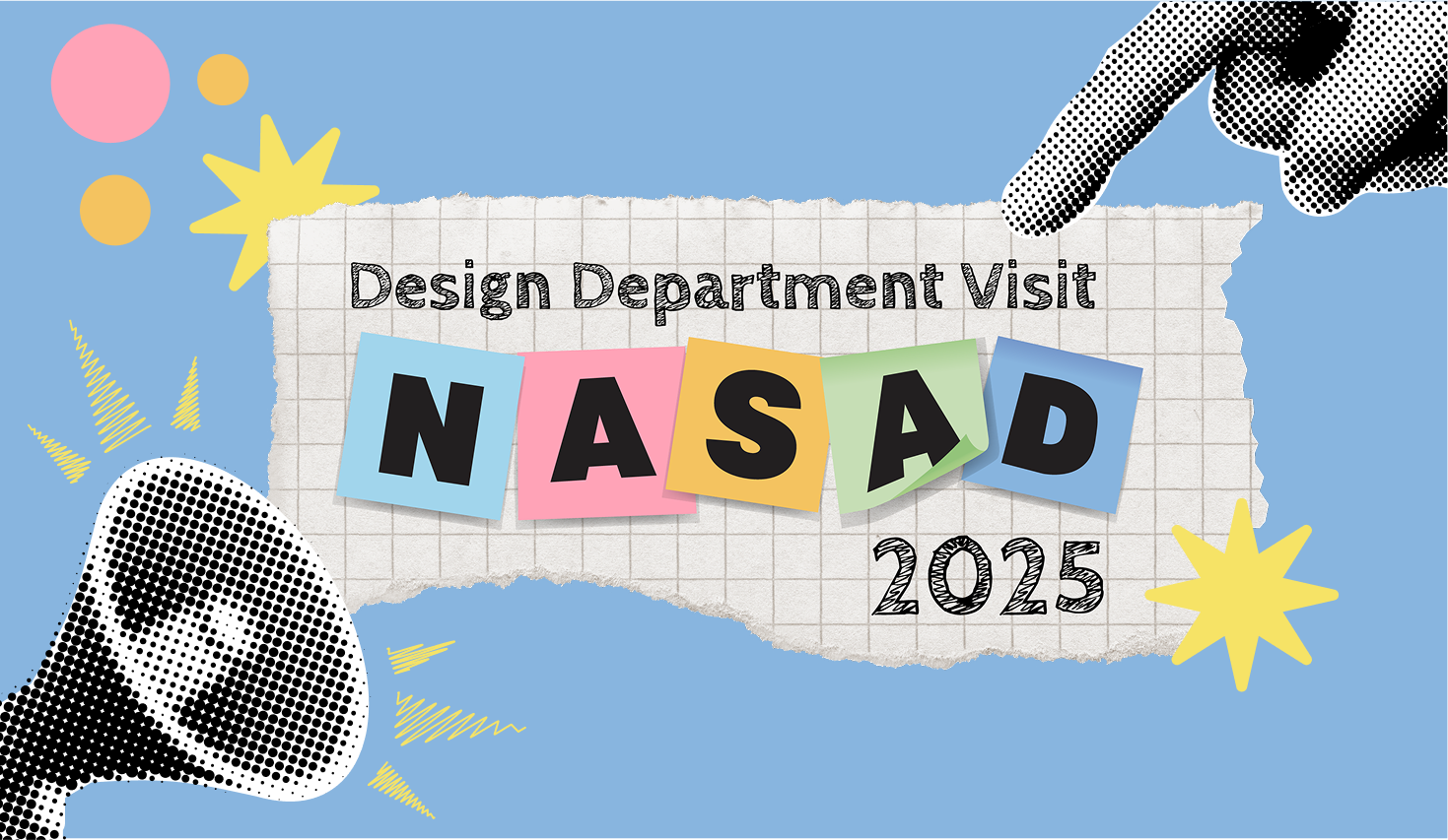
More refined logo iterations
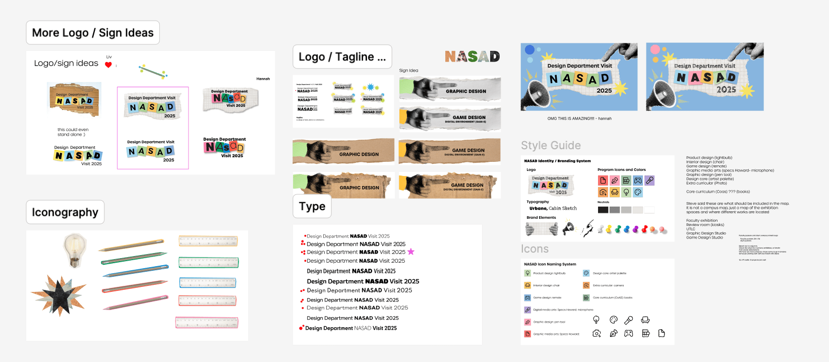
Figma Collaborative Board of Ideas and Elements
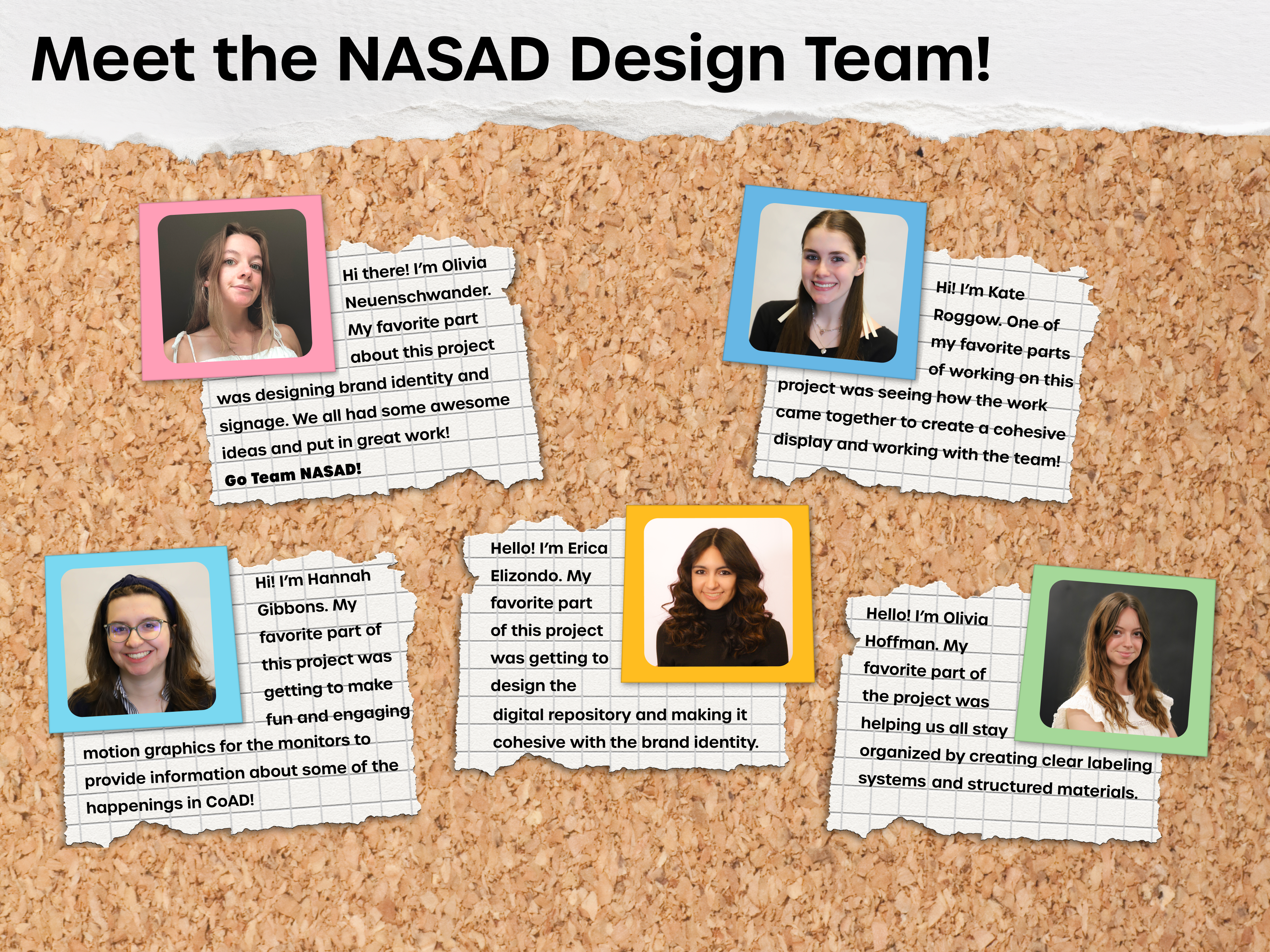
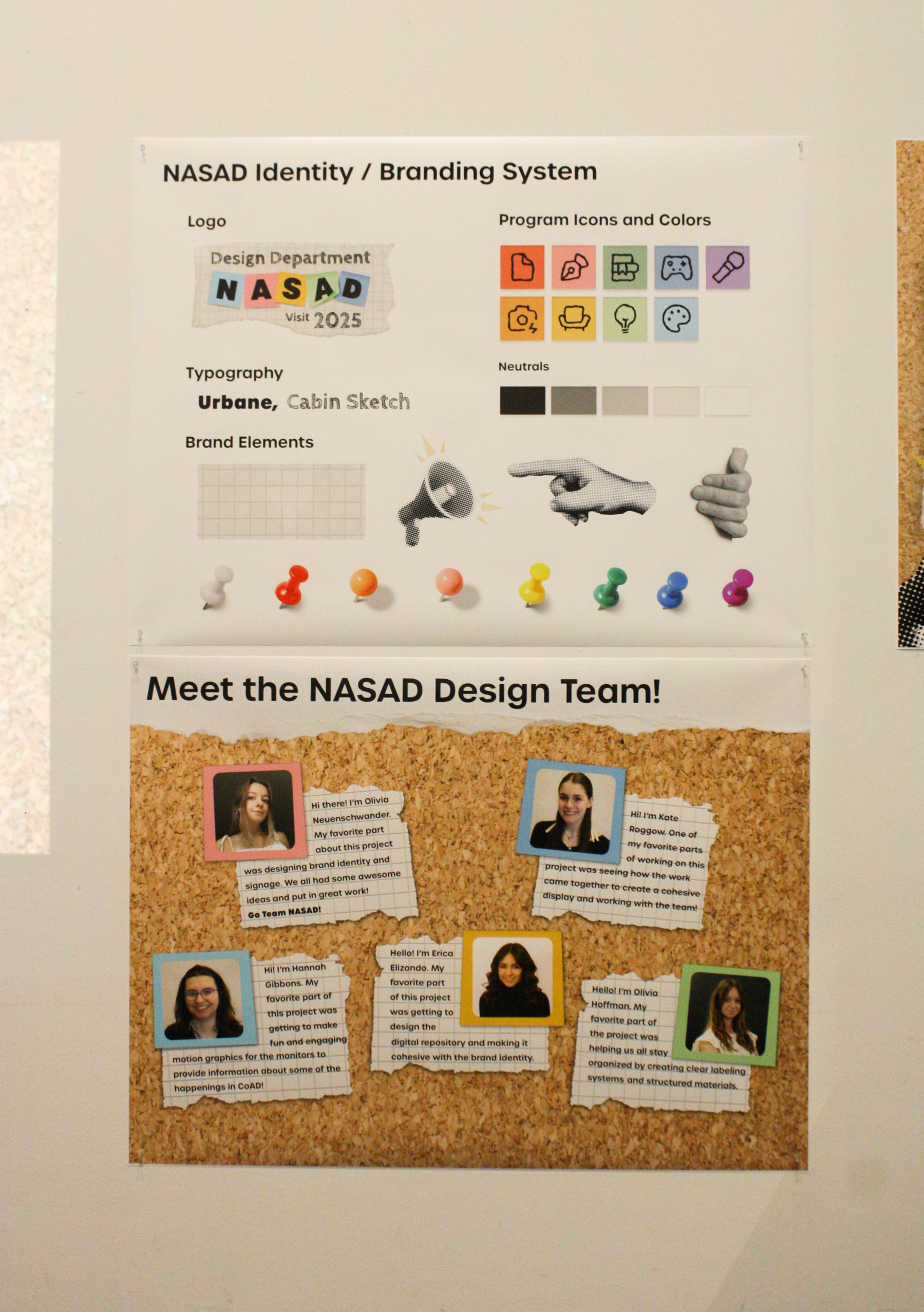
Design Team Bio Poster
To the right is the Digital Repository Site I designed and prototyped in Figma. The purpose of this was to house direct links to student work that the NASAD team could easily sift through and look at.
(Click to be taken to the site)
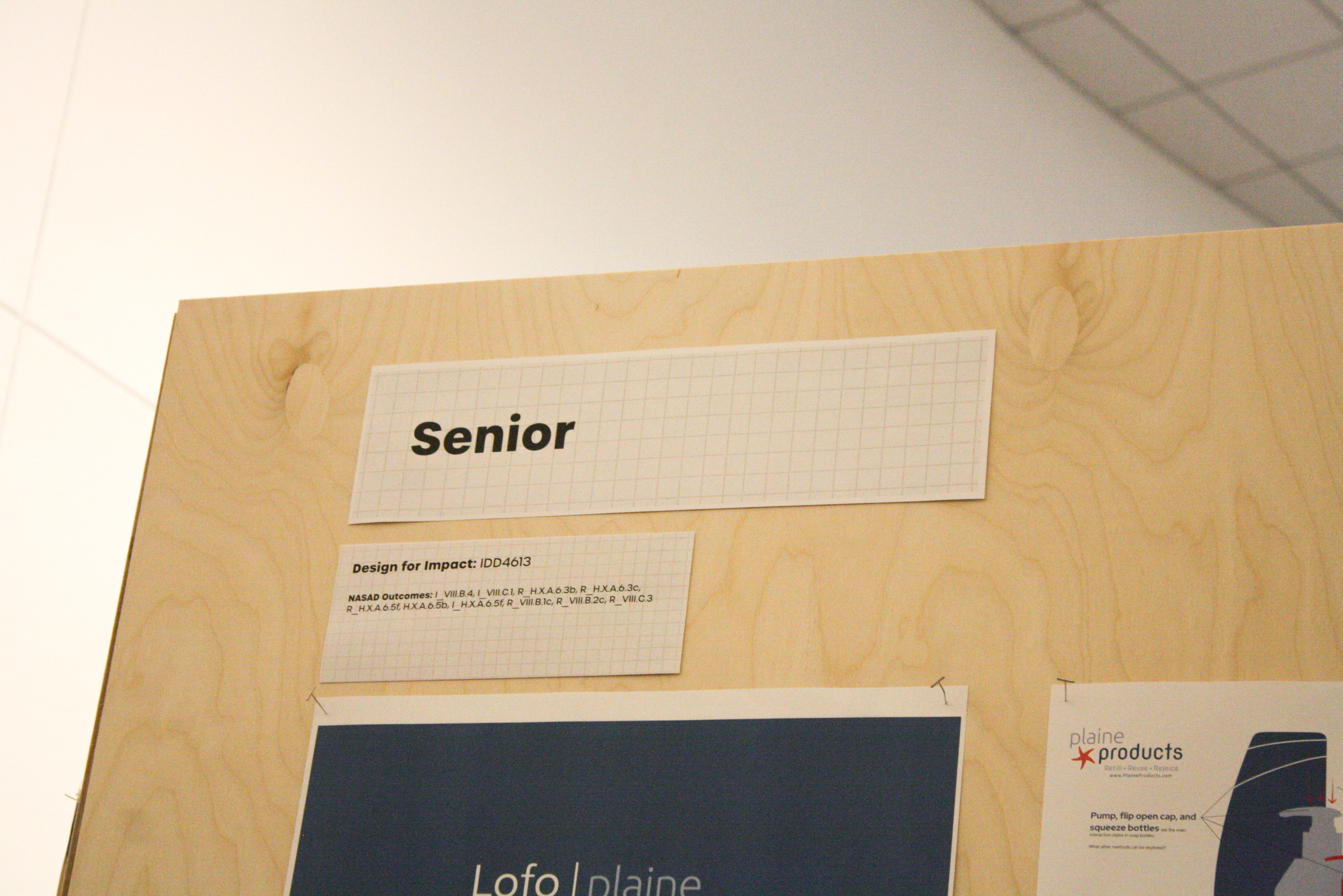
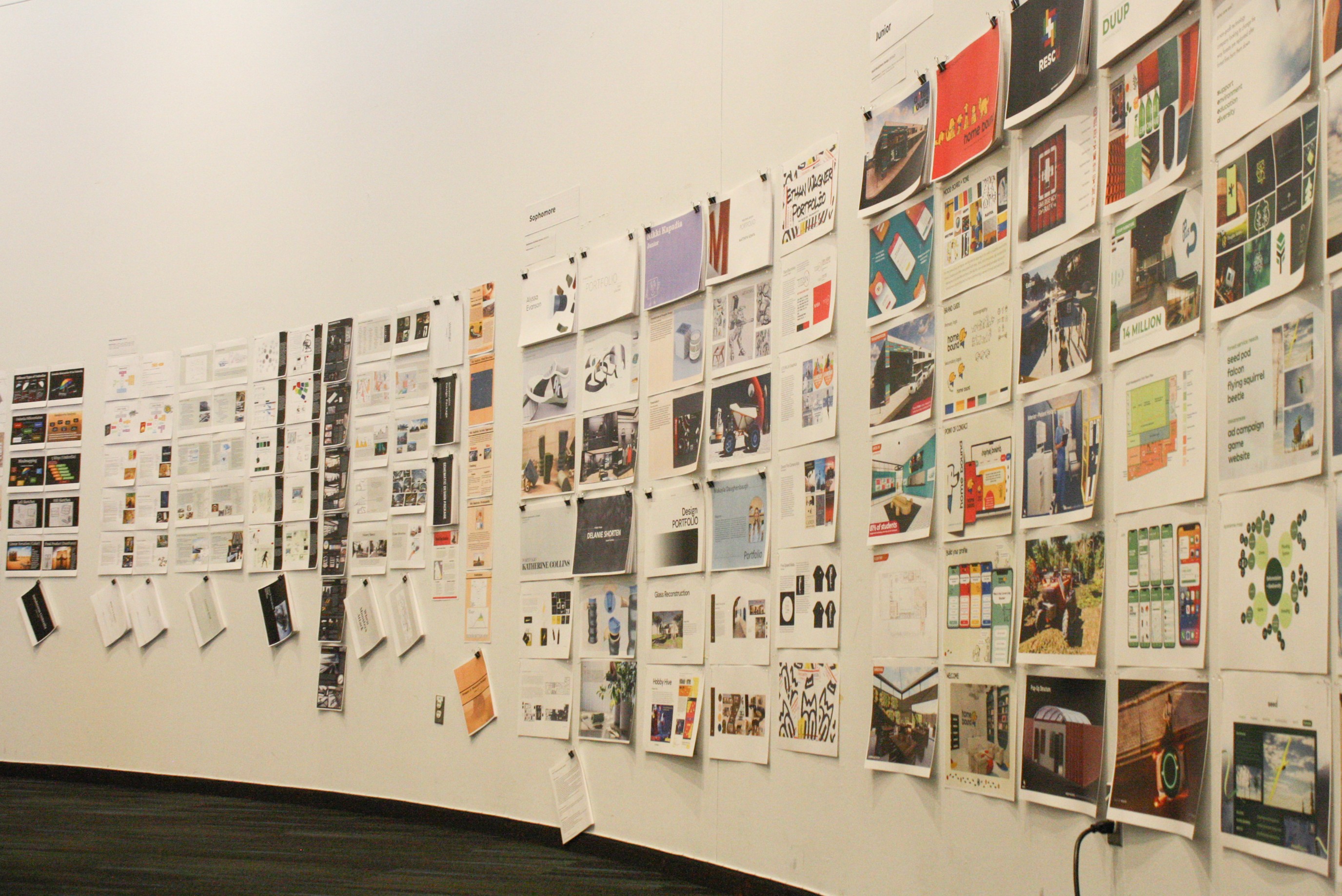
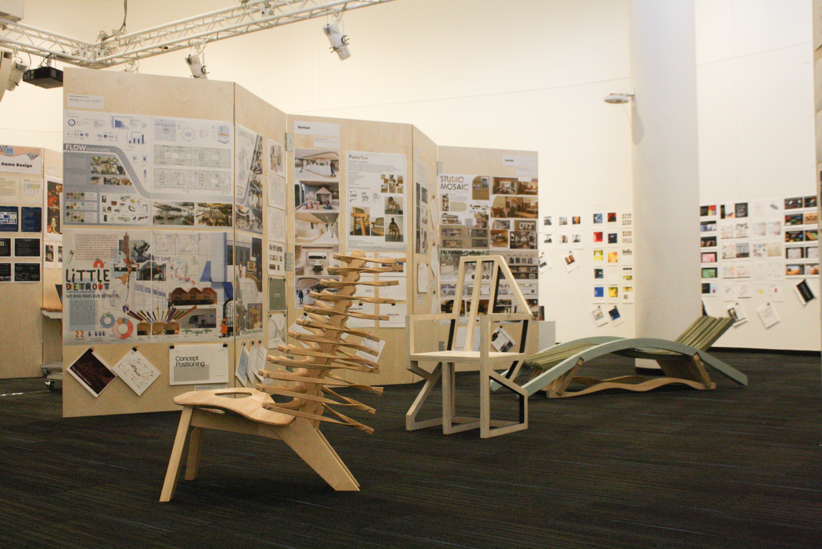
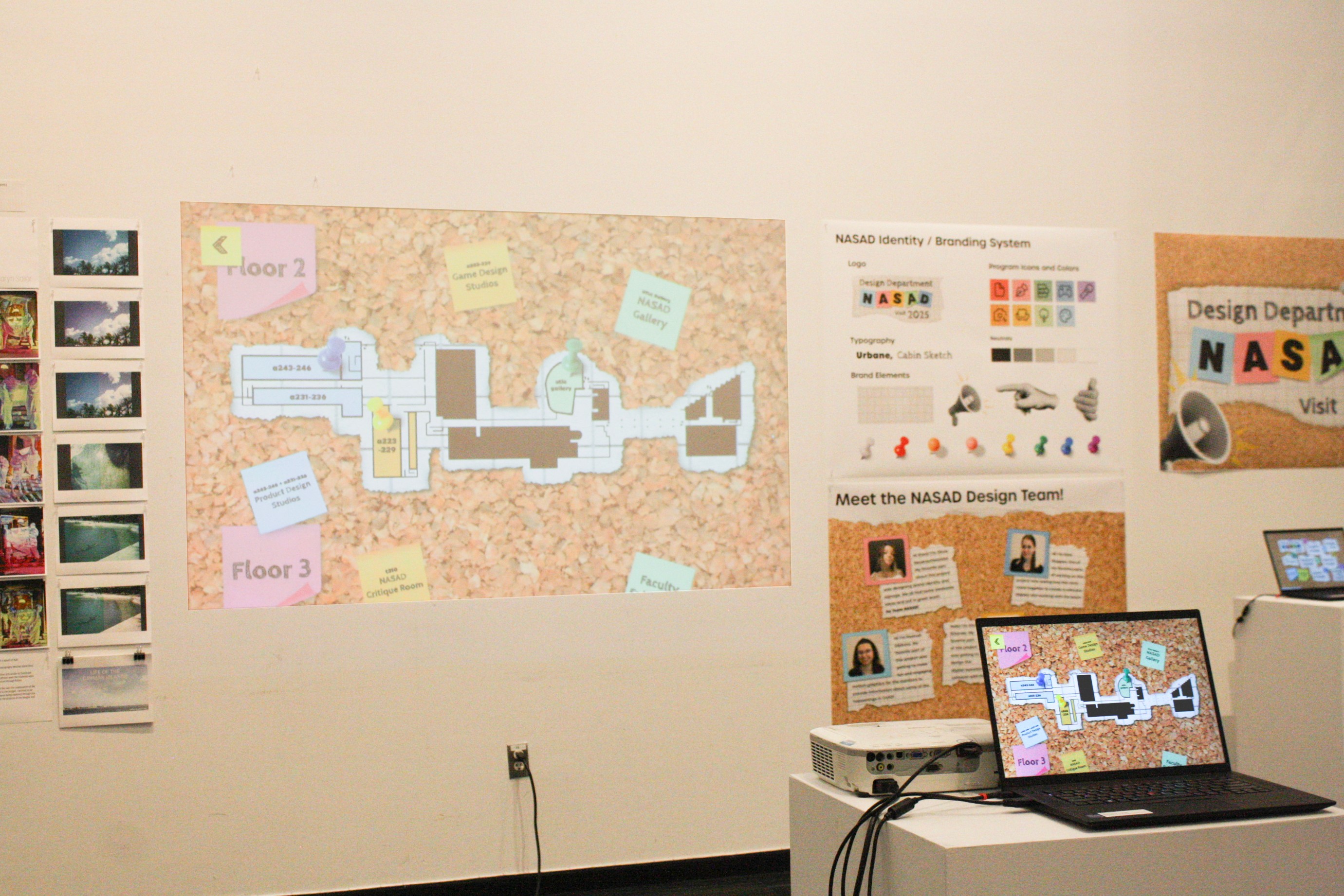
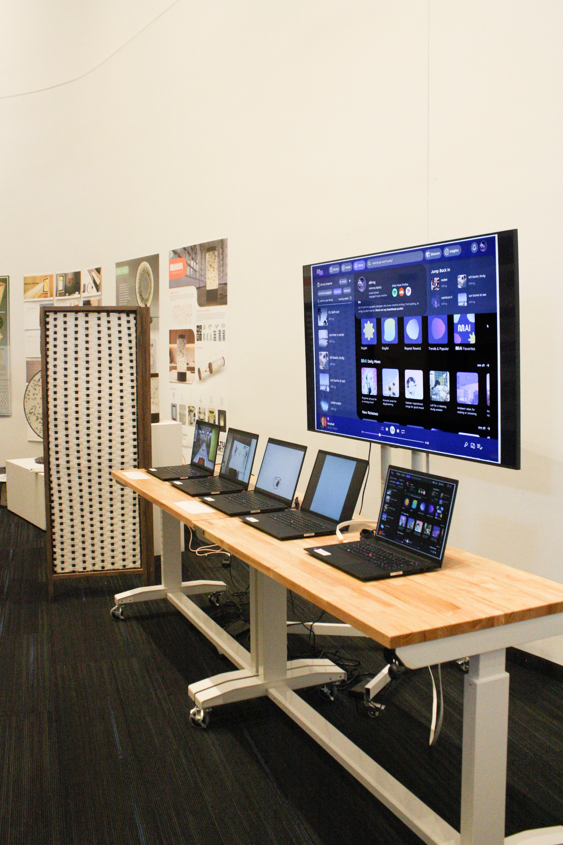
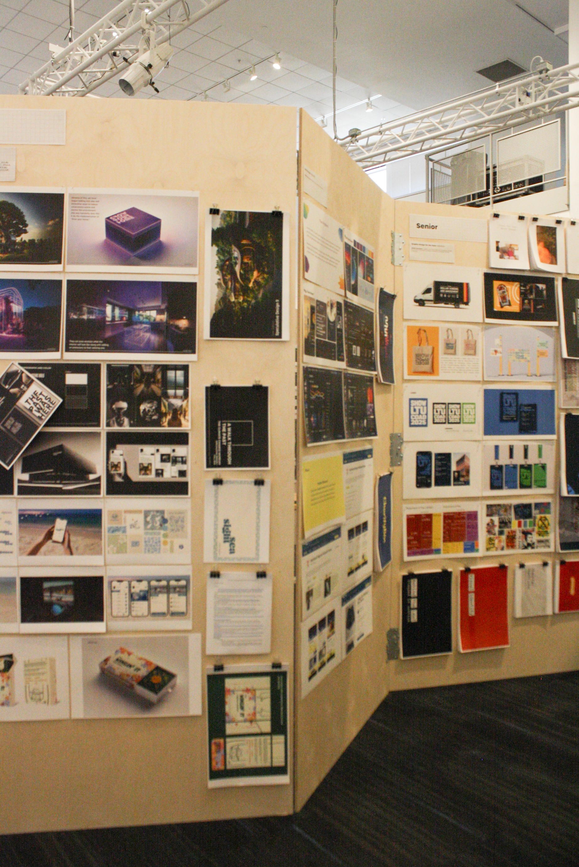
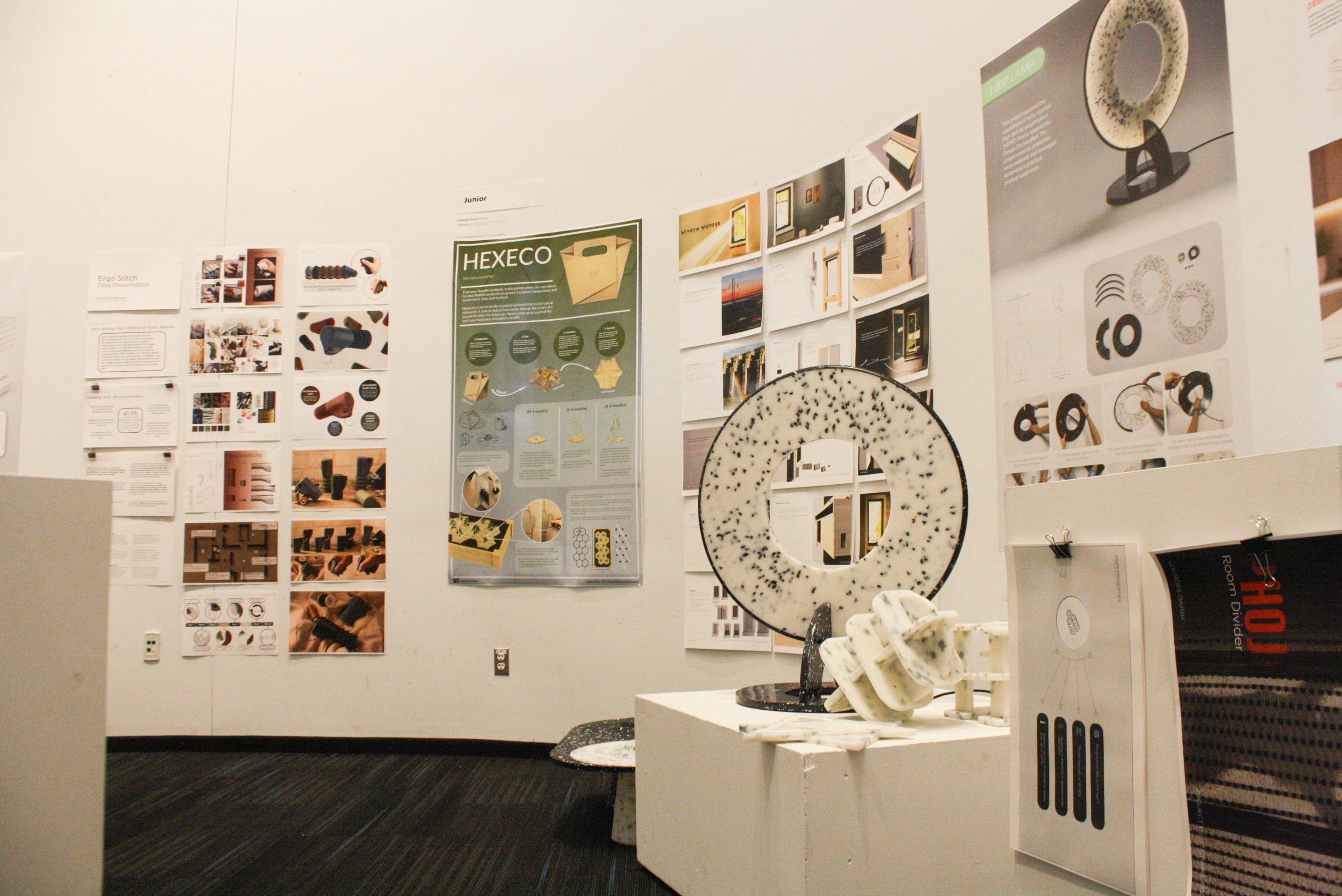
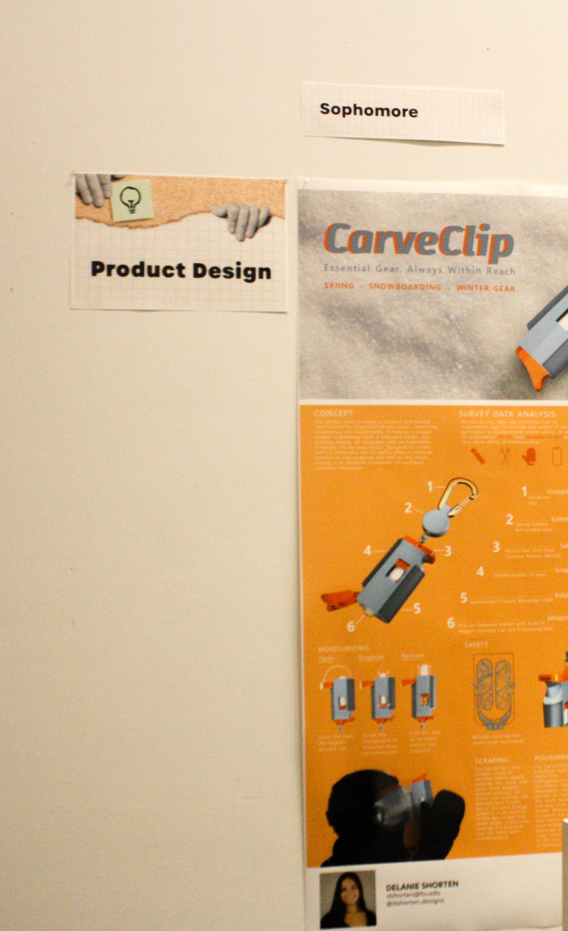
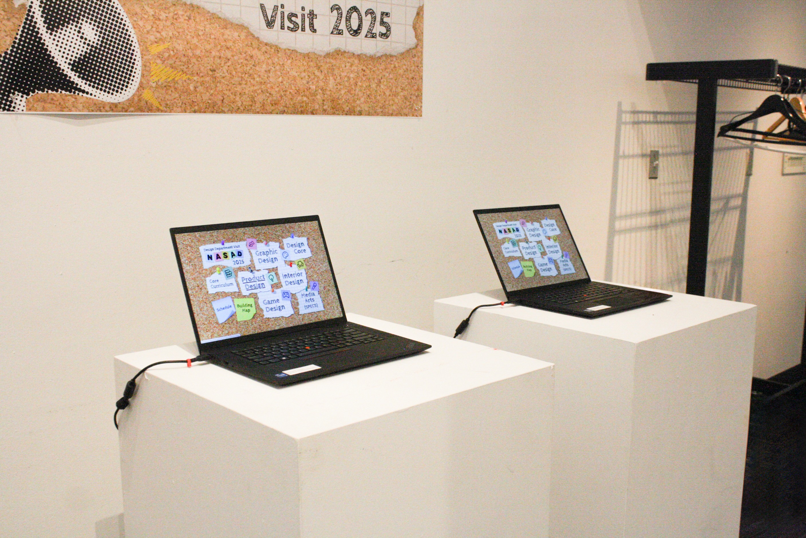
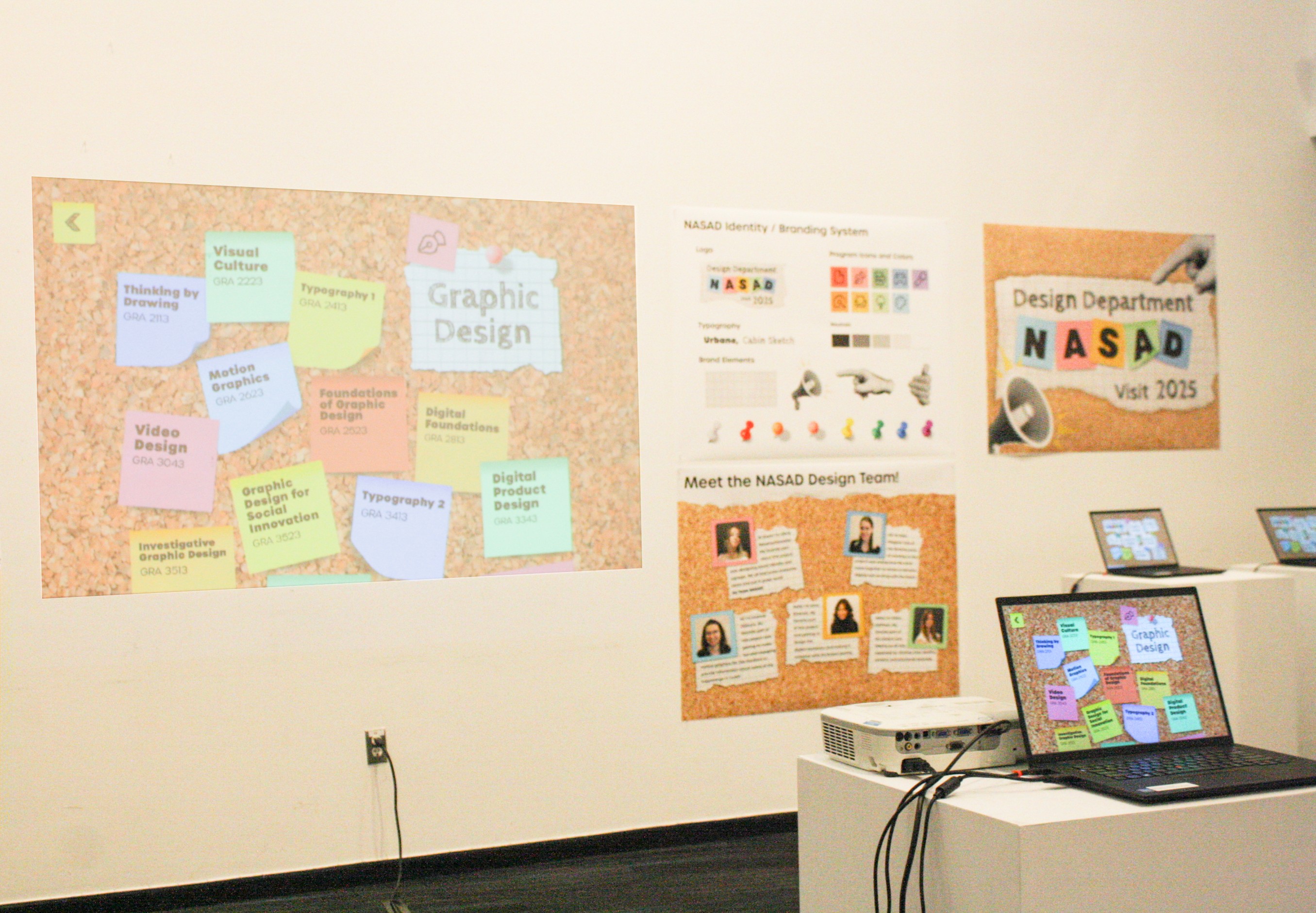
Below, are pictures I took of the actual exhibition. The team and I helped our professor set up the entire exhibiton and making sure everything was organized and properly labeled.
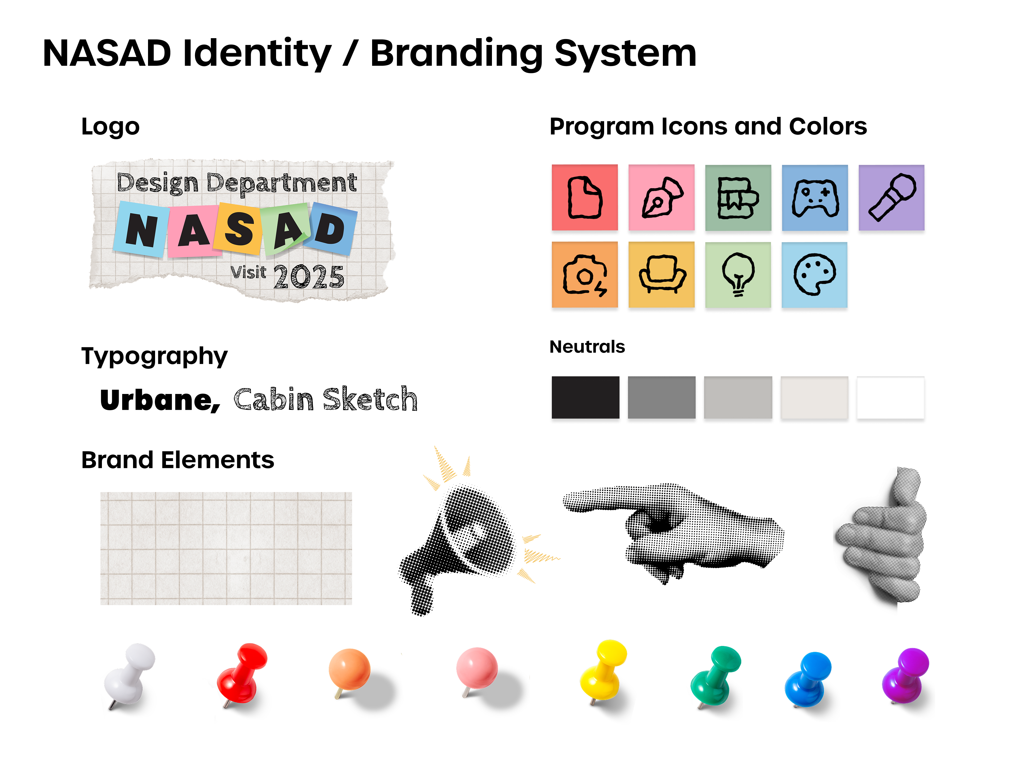
To the left are explorations of what typefaces we would use for the logo. With discussion and dot voting, we honed in on our favorite typefaces with further iteration. The final two typefaces ended up being Urbane and Cabin Sketch. We wanted something bold to contrast the handwritten and sketchy feel of the other.
Design Department NASAD Visit 2025
Design Department NASAD Visit 2025
Design Department NASAD Visit 2025

Design Department NASAD Visit 2025
Design Department NASAD Visit 2025
Design Department NASAD Visit 2025
Design Department NASAD Visit 2025



Design Department NASAD Visit 2025
Design Department NASAD Visit 2025
To the right are some early explorations of the NASAD Exhibition logo where we played around with the teams favorite typefaces. We also experimented with what elements or colors would be featured and how we would layout the logo with there being such a long title for it.
To the left is the overall NASAD identity including: the logo, typography, colors, icons and other elements. We developed a system where there was an icon representing each design program so that the programs would be more easily identified throughout the exhibition.